
AI - Powered Credit Card Recommendation Model
Testing, targeting & personalising the process of credit card selection for the users. Increasing TSR by 47% through data-driven design & guided interactive journey.
💼 Company
Fintech (B2B2C)

👩🏻💻 Role
Product Designer
📱 Platform
Web First & App

Project Overview
Build an AI-driven interactive flow to guide financially inexperienced users towards choosing the most suitable credit card, and with a goal of improving funnel conversion and reducing bounce rates.
👫🏻 Team
PO, Dev, Data, UX Writer
🕔 Timeline
12 weeks (Discovery -> Delivery)
🔬 Origin
Insight to Product Strategy
🌀 Challenge
Low 32% TSR with no guidance & overwhelming interface.
⚡️ Solution
AI-powered Q&A system that guides users to their ideal card
🚀 Impact
42% ⬆️
Engagement
16.34%⬇️
Drop-offs
Business Impact
35%
Higher conversion, Improved Funnel
-
Boosted form funnel performance, driving higher completion rates and more qualified credit card applications.
👩🏻🎨
Effective Design
-
Built the designs with a robust UI kit for effective documentation and consistency in the new feature
56%
Reduced Bounce Rates
-
Reduced drop-offs and bounce rates and increased retention on the platform and better product explorations.
User Impact
29%
Raised User Satisfaction
-
I raised user satisfaction by 29% from first shipped version through testing and redesigns for optimization.
🤝
Feature adoption
-
Credit Card participants engaged with all features including questions, suggestions and comparison tables, showing robust engagement across the tool's features.
🧘🏻♀️
Reduced Cognitive Load
-
Users were able to combat the choice paradox and land on the variant best suited for their needs, in a couple of easy steps, with less learning curve.
01 - Discovery
68% of users dropped off due to decision paralysis from 12+ confusing card options.
Key Pain Points
-
Users didn't understand credit card terminology
-
Too many options created cognitive overload
-
No personalized guidance through selection
-
Unclear which card best matched their needs
Business Impact
-
68% drop-off rate during selection
-
32% task success rate (industry avg: 75%)
-
Increased support tickets by 40%
-
Lost revenue from incomplete applications
Process to achieve the UX goal
WEEK 1
Understand
Identifying the problem
Research & Analysis
Elaborate + Cluster
WEEK 2
Explore
Ideating & Brainstorming
Prototyping
Designing + Aligning
WEEK 3
Test
Developed Solutions
Interviewing & Testing
Study Review
Conclusion
02 - Research
Understanding the Problem with Research & Analysis
A number of research was conducted to understand the problem and challenges in the current user journey of card selection and application.
01. Heuristic Evaluation & UX audit
-
Evaluated the existing credit card selection journey using Nielsen’s heuristics.
-
Found usability gaps such as inconsistent terminology, unclear navigation, and lack of progressive disclosure of information.

02. Behavioural & Funnel Analysis
-
Bounce rate analysis highlighted high abandonment during the card comparison stage.
-
-
Session replays showed users frequently leaving to research card benefits externally before making a choice.

03. Cognitive Task Analysis
-
Mapped each step of the application process to identify critical decision points and pain points.
-
Revealed that the majority of users felt overwhelmed due to an excess of tasks and comparisons, leading to indecision and drop-offs.


04. Main Frictions Mapped
Formed early hypotheses:
-
Personalised guidance could reduce cognitive overload.
-
Transparency in recommendations could build trust.
-
A structured, interactive flow could reduce drop-off rates.

Facilitated a Brainstorming workshop for the team
Conducted a workshop for the Customer Success + Product team for persona building, map emotions and possible journeys of the users.
Conducted the workshop based on 4 cognitive aspects:
1. User Personas
Who exactly is the Buyer?
2. Emotions
How would he feel throughout
3. Touch Points
What would the buyer interact with
4. Actions
What would the buyer do & decide
03 - Ideation
Ideating the Experience
Keeping the aim of solving 'choice paradox' for the users and help the user segment who are not very financially aware, make the right choice.
Conceptualised 2 solutions A and B.
Concept #A
The first idea focused on recommending cards based on the basic needs of the user by strategically classifying ththen in terms of type, purpose and branding, etc. This was powered by our product categorisation engine. This would include categories like 'Travel cards,' 'Lifestyle Cards', 'Entertainment', 'Healthcare', 'Trending' etc.
This was planned to take shape of static filters present on the Category landing page of Credit cards, allowing the users to interact with it at will.
It limited the scope of personalisation in the recommendation model, as it categorized cards purely on the basis of needs and made it difficult to include layers of income, employment types, motives, credit scores, etc, which act as major contributors in decision-making.

Filters came out as a less interactive model, which would not contribute to boosting the engagement levels a lot.
# Moreover, it requires the user to have an idea in mind before going using the filters, which may not be helpful for users in the browsing stage of their workflow.
💡
Concept #B
The second idea I explored is a guided exploration module on the cards Category landig page. This step-by-step recommendation tool that lets users tell us what they are working on so we can cater the recommendations to their specified characteristics and intent. Instead of showing users all 33 card variants and asking them to do the work to narrow down choices, guided exploration aims to offer them suggestions progressively. The goal is to be welcoming and accessible to all users, especially the first credit card users or who do not have much financial experience. Users can also feel in control as they tell us what they need for their work.

-> Concept A(filters) failed, because
Low Discoverability & Engagement
Users overlooked filters embedded in menus; most defaulted to pre-set options, showing minimal interaction and reduced engagement metrics.
No Personalisation or Context
Filters relied on user effort and prior knowledge rather than guiding them, resulting in generic outcomes that didn’t feel tailored to individual goals.
High Cognitive Load
Too many choices and dropdowns created decision fatigue, increasing drop-off rates and lowering completion through the funnel.
Weak Business Impact
The feature didn’t lift key KPIs like retention or conversion, as users failed to explore deeper features or return for repeat interactions.
We went ahead with the Concept #B
➡️ Hence, the 3-step guided model was introduced, conversational, adaptive, and personalized. It simplifying decision-making and driving higher engagement and completion.

04 - Design
Conceptualising storyboarding, userflow, wirefrming & pitching
After finalising the concept, I went ahead with defining the solution and designing the screens.


1. User Onboarding
In the first step, we will collect key details as employment status and past credit card usage.
With a tip to login for more personalised recommendations.
UX:
Sets user expectations for a guided and relevant journey with steppers and progressive disclosure.
2. Mapping needs
Asking about their primary goals with this new card, from building a credit score to travel points. + let users prioritise card features like no joining fees vs high rewards, etc.
UX:
Uses structured questions to surface intent without overwhelming the user + dejargonization.
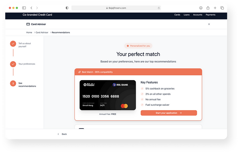
3. Next best actions
Presenting with the best fit recommendation variant tailored for user needs along with the 2 next best variants for comparison & transparency.
UX:
No Dead Ends,Clear primary CTA to apply, with secondary CTA of save for later + edge cases.


05 - Validation
Moderated Usability Testing to Test the Solution
Usability testing revealed the solutions pros and cons and the basis to build up on it.
Research Approach
-
Conducted a 10-participant moderated usability study combined with experience analytics to iterate and make data-driven design decisions.
-
Goals:
Validate the user flow • the feature discoverability • the tone of voice • the visual language
Participant Profile
10
Participants
5 Carded
5 Non-Carded
Delhi
Bangalore
Pune
< Rs 50K : 5
Rs 50K - 1L : 3
Monthly Income
25-50
years
Age
7M
3F
Key Insights - Discovery of Credit Cards
-
Most users learned about credit cards through calls from banks or while browsing online (Amazon).
-
Users cited lack of proactive support and difficulty finding clear information on bank websites.
Key Insights - Selection Criteria
-
Value-driven choices: Preference for low/no joining fees or lifetime free cards.
-
Shopping benefits: High importance of offers, discounts, and cashback.
-
Rewards system: Desire for better reward conversion and automatic bank transfer.
-
Lifestyle perks: Airport lounge access valued by some users.
-
Bank integration: Ease of payments & integration with primary bank accounts is a factor.
Design Direction
-
Shaped recommendation model to prioritize low fees, rewards, and bank integrations
-
Validated “Help me choose” feature: 100% of participants anticipated its function, confirming mental model alignment
-
Guided UX improvements for clearer information architecture and proactive communication
-
Identified and addressed discoverability gaps to enhance overall user experience

06 - Retrospective
What makes us keen to implement this?
100%
Understood the relevance
All the participants understood the entry point and the need to use such a model to arrive at a suitable card
Enhanced User Experience:
A credit card recommendation model provide users with highly personalised and relevant card offers, improving their overall experience.
Improved Financial Health:
By recommending cards that match users' financial profiles, the model can help users make informed decisions and potentially improve their financial health.
Risk Management:
AI can analyze user creditworthiness and recommend suitable cards, reducing the risk of defaults for credit card issuers.
Cross-selling and Upselling:
The model can suggest additional financial products and services, increasing revenue opportunities.
Impact on Business Goals
Leveraging testing to engineer a better targeting model
01
Help define a more crisper Targeting plan
02
Optimize the application funnel, increasing completion rates by 35% and reducing the bounce rate by 56%.
03
Increase engagement & can boost user retention and time spend on the platform
04
Understanding user preferences and what they desire from their Credit Card, to develop smarter Product Strategies

Future Problems Opportunities
Recommendations that make it easy for the users one card at a time
-
Advanced AI techniques, such as deep machine learning, pattern learning can also be explored for more complex scenarios in the future.
-
Implement personalisation by tailoring recommendations based on users' financial goals, spending habits, and creditworthiness.
-
Using AI to make real-time recommendations, adapting to users' evolving financial behaviors and needs.
-
Future developments should also focus on ethical AI and data privacy, ensuring that user data is handled with the utmost care and transparency.
Other Projects to read
Designing a Talent Strategy Solution for end-to-end talent management by clients

CX Playbook: Scaling UX Practices & Metrics Across Stakeholders
